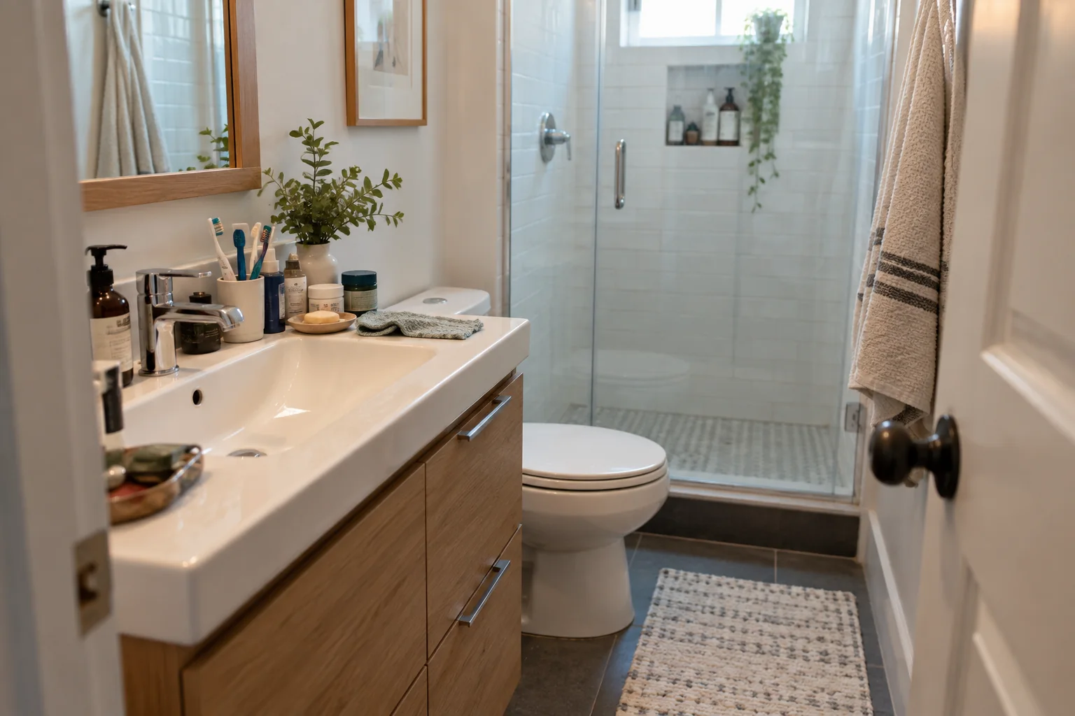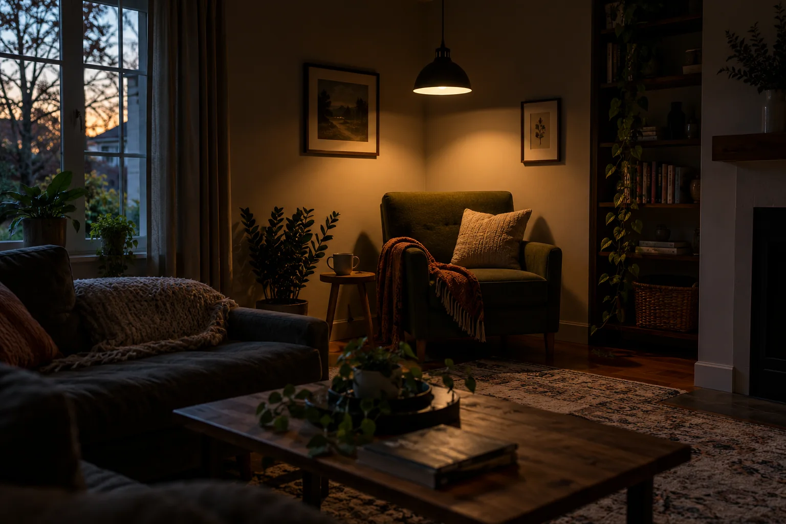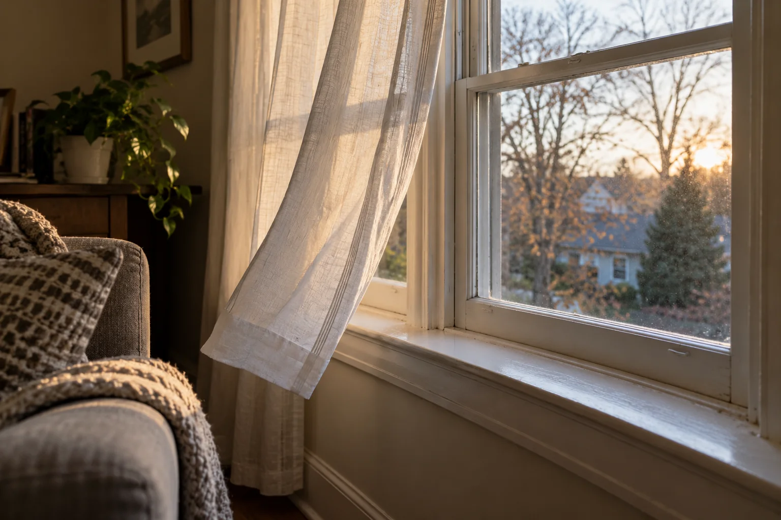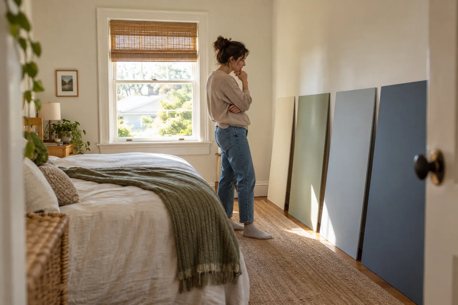
Choose colors alongside your fixed finishes, test large samples in several positions, and assess them at different times of day. Light paint alone cannot correct poor lighting.
A color chip under shop lighting is only a starting point. Your floor, curtains, neighboring walls, and lamps all affect how a paint color reads. A small room benefits from a coordinated choice more than a rule that every wall must be white.
Decision map
| Question | What to look for |
|---|---|
| Start with what stays | Collect a sample or clear view of the flooring, large furniture, and curtains. |
| Make larger movable samples | Apply the recommended coats to suitable sample boards and allow them to dry. |
| Choose sheen for use and condition | Different finishes reflect light differently and may show wall imperfections. |
| Coordinate the edges | Consider the ceiling, trim, and doors as part of the palette. |
Start with what stays
Collect a sample or clear view of the flooring, large furniture, and curtains. Look for warm or cool undertones. A clean cool white may look stark beside warm cream finishes, while a warm neutral may feel yellow under some lamps.
Choose a small shortlist rather than testing dozens at once. Compare candidates against the same neutral background so the old wall color does not dominate the judgment.
Begin with elements you cannot change
A small room already has a palette: flooring, fixed cabinets, countertop, tile, and the view through the window. Put samples beside those elements before considering a trend color. A cool gray that looks calm on a screen may clash with a warm wood floor. A creamy white may appear yellow next to a crisp white tile. Note which fixed material occupies the most visible area and whether you want the wall to blend with it or provide gentle contrast. This is more reliable than starting from a paint name.
Check the room at the times it is actually used. North-facing daylight, direct sun, and warm evening lamps can shift the appearance of a sample. Take photographs if helpful, but do not choose solely from a phone screen; camera processing and screen settings can distort color. Move a physical sample to several walls and corners. A color that works near the window may look heavy behind a door. The aim is a pleasant room in real light, not an exact match to a marketing photograph.
Decide what “larger” should mean
A light wall can reflect more light, but a small room does not have to be white. A deeper color used consistently can make boundaries feel less visually busy, while a pale color may make a room feel open when there is good contrast and lighting. Decide whether the priority is brightness, calm, warmth, or a particular feature. If the room has little daylight, a very cool pale color can sometimes feel flat rather than spacious. Test alternatives instead of applying a universal rule.
Think about the ceiling and trim as part of the composition. A strong contrast can outline every edge; a closer relationship can make the envelope feel calmer. Neither is automatically correct. Look at door frames, baseboards, and adjacent rooms before deciding whether to repaint them.
Make larger movable samples
Apply the recommended coats to suitable sample boards and allow them to dry. Move them between the window wall and a darker corner. View them in daylight and with the lamps you use at night.
Do not judge wet paint or a tiny dab. Keep notes about when a color feels comfortable and when it changes in a way you dislike.
Use samples large enough to judge
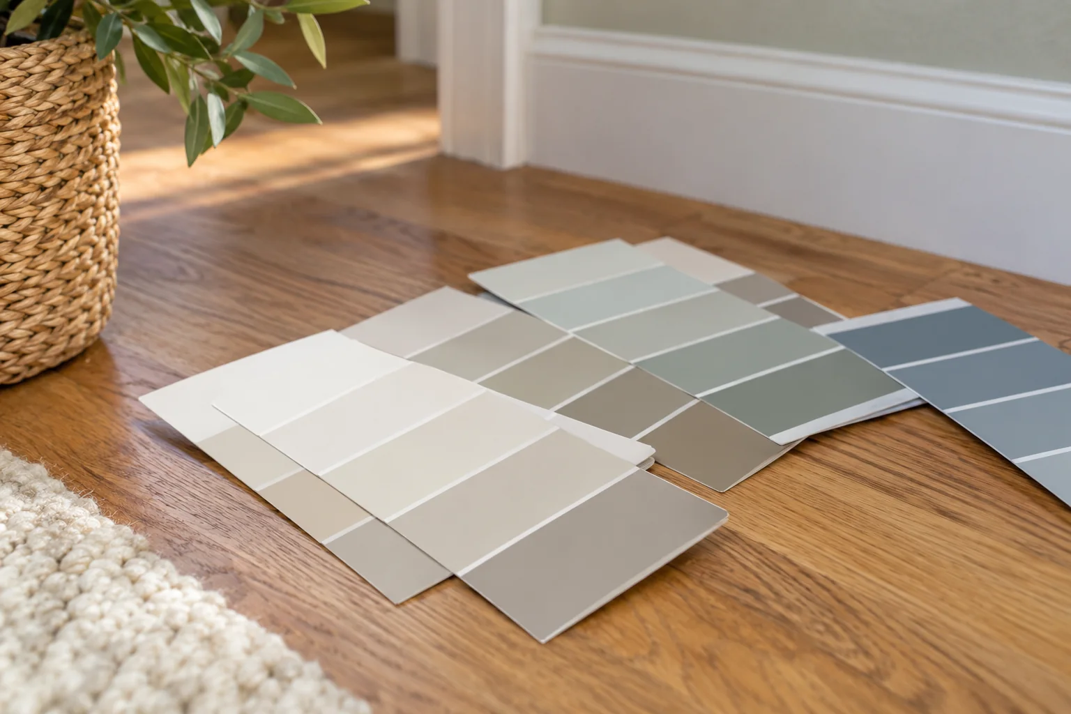
Tiny paint chips show hue but not how a wall will feel. Paint movable sample boards or use manufacturer samples large enough to place beside furniture. Follow the sample product's instructions and allow it to dry fully. Put the boards at eye level, then move them to shadowed corners and near the floor. View them in morning, afternoon, and evening light. A color should survive the room's least flattering ordinary condition, not only a bright afternoon.
Compare a small shortlist, perhaps two or three colors, rather than covering every wall with dozens of test patches. Too many adjacent swatches can distort how each is perceived. Leave a neutral gap between boards or view them one at a time. Write the product name and code on the back, not across the painted face. A family member may see undertones you missed; ask what they notice without telling them which color is your favorite first.
Look for undertones, not only lightness
Two paints with similar light-reflectance values can feel different because one leans pink, green, yellow, or blue. Place the sample beside the flooring and fabric that will remain. If a neutral appears unexpectedly purple, the contrast may be revealing its undertone. Test a warmer and cooler alternative rather than merely moving one shade lighter. A small room often shows a color on several walls at once, so undertone differences can become more obvious than in a large open room.
Do not assume online names such as “linen” or “stone” describe a predictable color. The same name can look different across brands and finishes. Trust the physical sample in the actual space.
Choose sheen for use and condition
Different finishes reflect light differently and may show wall imperfections. Follow the paint maker's guidance for washability and the room's moisture exposure.
If the walls are uneven, repair them appropriately before choosing a reflective finish. Paint cannot disguise every ridge or patch, particularly when light grazes across the surface.
Match sheen to use and wall condition
A higher sheen can be easier to wipe in some products, but it also highlights bumps, patches, and uneven plaster. A flatter finish can soften imperfections but may have different cleaning limits. Read the exact paint's performance claims and care instructions. Consider children, cooking residue, moisture, and how often the wall will be touched. In a small room, the light often strikes a wall at an angle, making surface defects more visible. Repair and prime appropriately before relying on paint to conceal them.
Test the chosen finish on a small area, not just the color. The same tint can appear slightly different in a matte and satin sheen. View it with the room's lamps on. If glare appears across a wall, try a different sheen or adjust lighting. A finish that looks perfect in a store display may be uncomfortable in a narrow room with a bright window.
Prepare safely
If the existing paint is old and may contain lead or another hazardous material, get appropriate assessment before sanding or scraping. In the United States, EPA guidance flags pre-1978 housing as a potential lead-paint concern. Follow local rules and the paint maker's ventilation, surface preparation, and drying instructions. Repair holes and stains before painting. A fresh color does not fix moisture or a peeling substrate. If a wall is damp, identify and correct the cause first.
Protect floors and fixtures, label samples, and keep the room ventilated as instructed. Choose a realistic sequence so the room is not used before the coating is ready.
Coordinate the edges
Consider the ceiling, trim, and doors as part of the palette. Softer transitions can make the room feel calmer; stronger contrasts can deliberately define its shape.
Before buying the full quantity, confirm coverage, coats, primer needs, and batch consistency with the supplier. Keep the product name, color code, and sheen for future touch-ups.
Coordinate edges and transitions
The relationship between wall, ceiling, trim, and adjoining rooms affects the final impression. Put sample boards near the doorway and look from both rooms. A calm transition may matter more than an isolated perfect color. If the small room has open shelving, consider how the contents will read against the wall. A bold color can make objects pop; a subtle one can let storage recede. Neither strategy fixes clutter, but the right contrast can make the space easier to read.
Do not forget switches, curtains, and large furnishings. A warm wall beside a cool white sofa may look different than expected. Bring fabric or flooring samples into the decision, or photograph them together under the same light for comparison. Avoid ordering a full room's paint before the large sample has been observed for several days.
Evaluate after living with it
Once painted, let the coating cure according to its instructions before scrubbing or installing wall-mounted items. View the result in the room's normal lighting. If a color feels too dark at night, improve task and ambient lighting before repainting immediately. If it feels harsh by day, consider window treatment or a different lamp temperature. A single color does not work independently of light.
Keep the paint code, brand, sheen, and room name in a home note. Touch-ups may differ as the wall ages, so retain enough information to match or repaint a full plane later. The best small-room color is the one that works with the fixed finishes and daily use, not the one that wins on a tiny chip. Large samples, several light conditions, and a clear priority make the choice far less speculative.
If two samples still seem equally good, choose based on the room's least favorable light and the fixed finishes you are keeping. A color that looks acceptable in both conditions is usually a safer long-term choice than one that looks spectacular for one hour and awkward for the rest of the day.
Compare options against the room you actually have
A product recommendation is useful only when the room's constraints are clear. Record the dimensions, existing finishes, amount of daylight, moisture exposure, and how the space is used on a normal weekday. Choose two or three criteria that matter most rather than trying to optimize every feature. For a busy household, ease of cleaning and repair may outweigh a perfect showroom appearance. For a low-use room, visual comfort may matter more. Write down your priorities before viewing samples so a dramatic display does not reset them.
Test a sample where it will be used. Look at it in daylight and evening light, beside the fixed elements that are staying. If the decision involves a product, read the maker's care and installation instructions for the exact model. An appealing material that requires a maintenance routine the household will not follow is a poor fit, even if it performs well in a brochure.
Keep the decision reversible where possible
Begin with changes that can be moved, sampled, or returned before committing to demolition or permanent installation. Check the return policy and sample-size limits. Photograph your before condition and keep notes on the trial. After a few days of ordinary use, ask what improved and what became less convenient. This reveals tradeoffs that are easy to miss during a quick purchase.
If work requires wiring, plumbing, structural changes, or disturbing unknown old materials, involve appropriately qualified people. Ask for the total scope and what will be visible when the job is finished. The right choice is not simply the most popular option; it is the one whose limitations you understand and can live with. A deliberate small test often prevents an expensive correction.
Frequently asked questions
Must a small room be white?
No. Dark colors can feel comfortable, but assess the whole palette and lighting before deciding.
Why does the same paint look different on two walls?
The direction and color of light, shadows, and reflected nearby colors change its appearance.
Sources & further reading
Manufacturer instructions for your exact model take priority.